

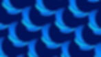


Our objective was to create a social media presence that was story-driven and cohesive. Icons, illustrations, and photography merged into a social media quilt that boosted recognition, and amplified the Easable narrative.
Social Media
Pfizer | Easable
Crafting a unique corporate offering with an architecture designed for multiple audiences.

Pfizer saw an unmet need: Large, corporate employers lost business because of flu and Covid-19. Pfizer created a BETA platform in the form of an app that would be created by Pfizer but dispensed under the employer (tenant of the app as they’re known throughout this case study). The employee could access telehealth, vaccination, and test kits in a cohesive, all-in-one interface, AND they were able to get it at a lower cost.

Our Solutions
INTERNAL TEAM: The client team had one overstretched marketer. We partnered with her to guide the brand team and stakeholders through workshops, shaping the brand’s strategic vision, manifesto, and positioning while capturing a shared passion for the brand.
NAME GENERATION + BRAND ARCHITECTURE: Trademarking criteria made naming complex. Balancing legal requirements with strategic alignment, we explored more than 1500 names and 200 logo options. The process led to a name that was not only on strategy but embraced by all stakeholders.
BRAND CHAMPIONS: Our role was expanded into brand stewardship, acting as brand champions across strategy and design. We directed over ten vendors to ensure consistency, ADA compliance, and design integrity, and we built scalable templates and frameworks that were segmented for B2B, B2C, and internal education. By overseeing implementation across all applications, we maintained brand continuity while solving for accelerated timelines and scalable execution.


Sound Design


Name Generation + Logo
Easable was the most strategically sound name for the program.
The logo design captured the Functional and Emotional benefits defined in the workshop:
-
Functional: The three-tiered offering of vaccination, diagnosis, treatment are represented by three overlapping leaves
-
Emotional: The three leaves are hugging and protecting the “e.” We selected an approachable round, sans serif, font that played into the nurturing brand persona.
-
Pfizer brand: Is reflected in the color palette


Style Guide
The guideline had to be very precise and granular so that the 10+ vendors and partners could easily execute materials in a cohesive brand style.

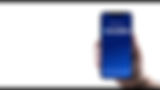
The App
We chose a unique illustration style to create an approachable and friendly brand visual voice. Additionally, illustrations were easier and quicker to execute as well as more budget-friendly when negotiating for buyout rights. The 3 sections were color-coded for easy recognition.
Large font and legible text ensured ADA compliance.

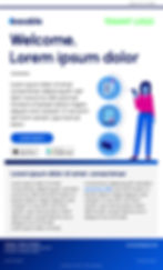
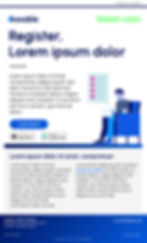
Website
Pulling through all the app elements for consistency.
Dashboard
An employee dashboard analytic to track the program.
We worked with the developer to streamline the user experience, ensure branding was cohesive, and collaborated with the client on refining the content and its flow.


Digital Screens
We created two animation styles for corporate screens—illustrations and photography, letting employers customize descriptions and add their logo to fit their culture.
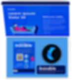
Starter Kit + Patient Materials
ACOMPANY developed patient templates for promotional and educational materials, and starter kit. We guided and directed the AOR through production, ensuring brand cohesion.


Email Campaign
Email templates extended the branding to a membership campaign, keeping the patients engaged.

Modular PowerPoint
We built a modular PowerPoint system for internal and external use: B2C style for external, corporate and education-focused for internal, featuring logo-ready covers and data-forward interior pages.


Sales + Rep Education


Included backgrounds for Teams meetings, email signatures, wallpapers for conferences and merch.


Toolkit

For team meetings we created backgrounds using the illustrations from the app.
The user could apply the day or evening themes. Perhaps change it according to their timezone!
The Easable team had a lot of fun with these.


Icon Library
We created a comprehensive, approachable icon library to ensure a seamless experience for patients, tenants, and internal teams. Each icon was developed in simplified, illustrative, and digital versions for optimal reproduction, while data visualizations were kept simple and corporate.